The video for this section demonstrates a variety of ways of interacting with your QuPath interface to highlight various types of information, from the Brightness and contrast dialog to class and object visibility.
Channel names and colors
Channels can be viewed using the Brightness and Contrast tool, as shown in the video. There are several methods for editing the settings visible in that interface, including scripting, text files, and directly through the interface. One of the most useful things to pay attention to is the set of checkboxes below the channel list, which enable you to maintain the same visual settings between images and pick out a single channel as grayscale without unchecking all of the other channels.
Inverting the background can sometimes make nicely striking visuals, for example creating a fake-brightfield image using standard histological stain colors, but is otherwise less useful. You can obtain the same effect by swapping the positions/values of the Min and Max display.
Channel Viewer
The Channel viewer is especially handy when you have a second monitor to really expand it out. It is responsive to the currently visible channels and allows you to see them separately for a given location under the cursor.
The context menu contains a variety of zooms, allowing you to inspect your data at a variety of different levels
Hold down SHIFT+SPACEBAR to lock the position of the Channel viewer focus - this will allow you to take screenshots or export information more easily. The same behavior can be triggered by using the context menu to uncheck Synchronize to main viewer
Save channel sets along with Brightness and Contrast settings using the Settings dropdown within QuPath (0.5.0+). See 1:55 in the video.
Select the channels and min/max settings you want.
Click on the Save button to the right of Settings, enter a name, and then Okay.
Create several of these, and use the dropdown to swap back and forth between sets of channels. This functionality becomes increasingly useful the more channels you have, though it is also very useful just to toggle between a pseudo brightfield view and standard fluorescence.
The Brightness & Contrast dialog can be accessed through the half dark circle button, and the various number keys can be used to toggle on and off channels. Also seen here are the Grayscale and Invert background options.
Combining both recoloring and inverting pairs of channels, users can achieve the semblance of brightfield images.
Demonstration of saving channel settings.
Object visualization options within QuPath, including toggles for all major types of objects, pixel classification overlays, and an “overall” transparency slider for all objects. Note that there is no individual transparency slider for each individual object type.
Optimize cell visibility by ensuring both detection visibility options are selected, and the opacity slider is all the way to the right.
Additionally, using the context menu within the Viewer (right click on a cell) to select the Cell boundaries only option for complete opacity.
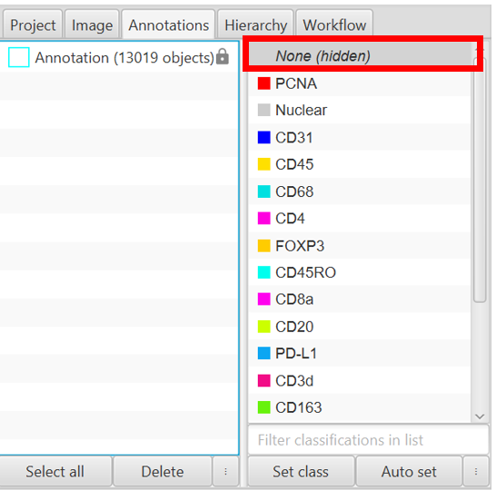
Selecting None and pressing the space bar will result in None being hidden. This may be the majority of your objects as most objects default to None when created!!
Object visualization
The user interface has a decent selection of visualization options, including turning the three main types of objects on or off, toggling the pixel classifier overlay, toggling names, and a slider that controls the transparency of most on screen objects. Currently selected objects are not impacted by the visibility settings and will always be shown.
Measurement Maps
All detections have some set of measurements associated with them, and measurement maps can be a nice way of visualizing those measurements. As you gain more comfort with the interface and scripting, this can become a powerful tool as you can create new measurements related to things like the overlap or correlation between multiple channels, which might otherwise be difficult to visualize with the channel viewer across your entire sample.
2. Object visibility
The various types of objects can be toggled on or off as seen in the images to the right. The slight exceptions to the toggle rule include the second green “detection fill” button, which only functions if detections are visible in the first place, and the somewhat hidden “type of cell visibility” option which can be found through the context menu in the Viewer, or through the View menu.
The two most useful features I have found for changing the type of cell view are 1. Making the objects completely opaque by selecting Cell boundaries only, and 2. using the Cell centroids only option when visualizing multiplex classifications (somewhat obscured in the image to the right, but it is the bottom option in the context menu).
If some function seems to be not generating any objects, or if you are ever confused about what is showing up in your image, make sure to check your object visibility toggles first!
The other way you can lose objects is by turning off classes in the Annotations tab. The most common issue here is tapping the space bar while having the None class selected, which results in the image to the right. In this case, any standard cell detection, StarDist, or CellPose, will generate invisible objects, as they normally start without a classification. Select None and press the space bar again to toggle the visibility back on.


